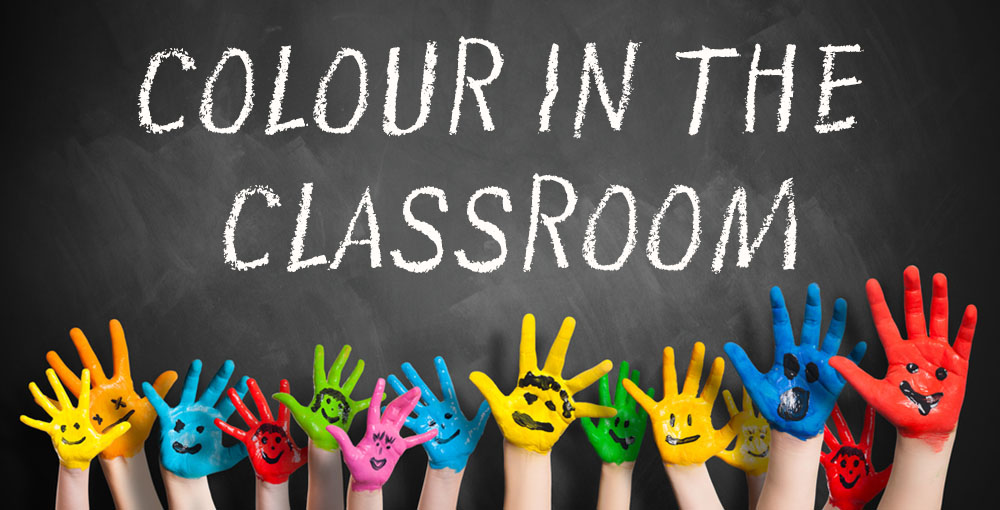
It's widely known that different colours have different effects on behaviour, learning, mood and energy of a room. With many studies dedicated to the effects of these colours, we have done our homework to narrow down the range of sources to create this easy to digest guide for your classroom.
There are various ways to introduce colour into your classroom whether this be through painting and decorating walls and partitions or through introducing colourful classroom furniture and accessories, either way, we recommend adding in colour where ever you can.
So what do each of the primary and secondary colours mean and evoke?
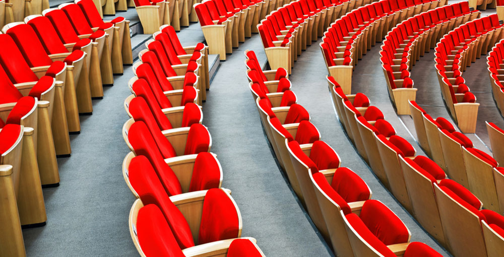
As you can imagine red evokes energy and passion, its a stand-out colour that should be used in rooms that are aimed at being interactive and encourage participation such as English rooms, Drama studios and Music rooms. Use this colour sparingly as this could be intimidating if used too much.
Blue is widely known as one of the most calming colours and evokes contemplation. Subjects in need of focused study and libraries benefit from its calming effects. Make sure the blues you choose are either light or bright, as these promote calmness and productivity. Darker tones can work well where individual working is required but only in small amounts, larger amounts can have a negative impact on mood and energy levels.
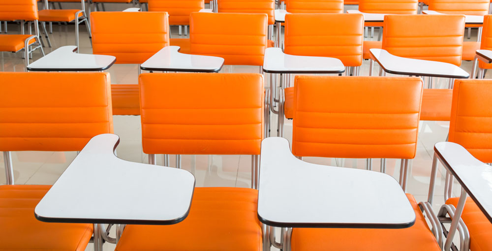
This vibrant colour evokes energy and warmth and works well in social environments, communal areas, dining rooms, canteens and receptions. In small amounts this colour evokes happiness but used too much and combined with red or yellow could cause overstimulation.
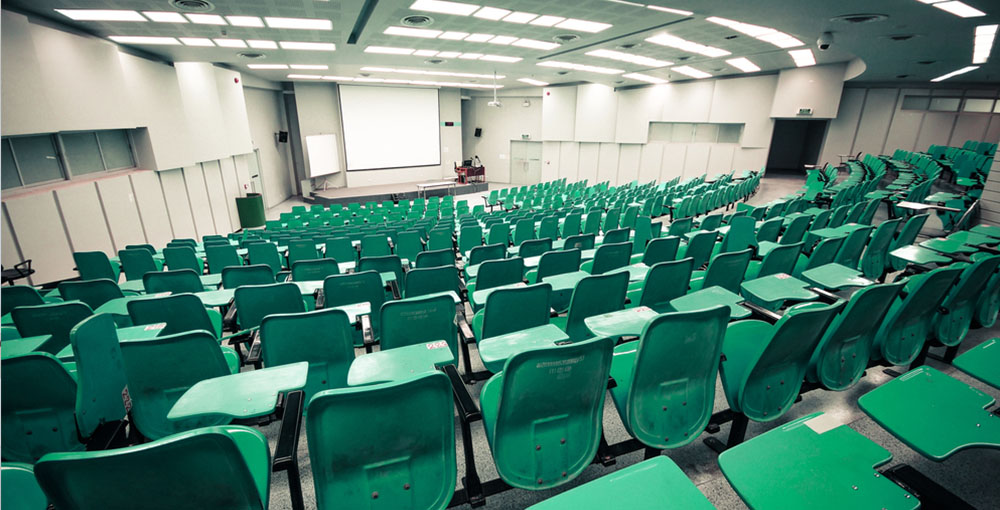
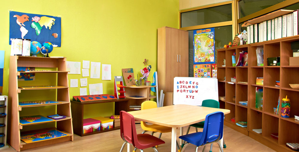
Green is another calming colour, reminding us of nature, that is the easiest colour on the eye out of all colours. This colour provokes harmony and balance making it perfect for rooms that will host team work and combined study.
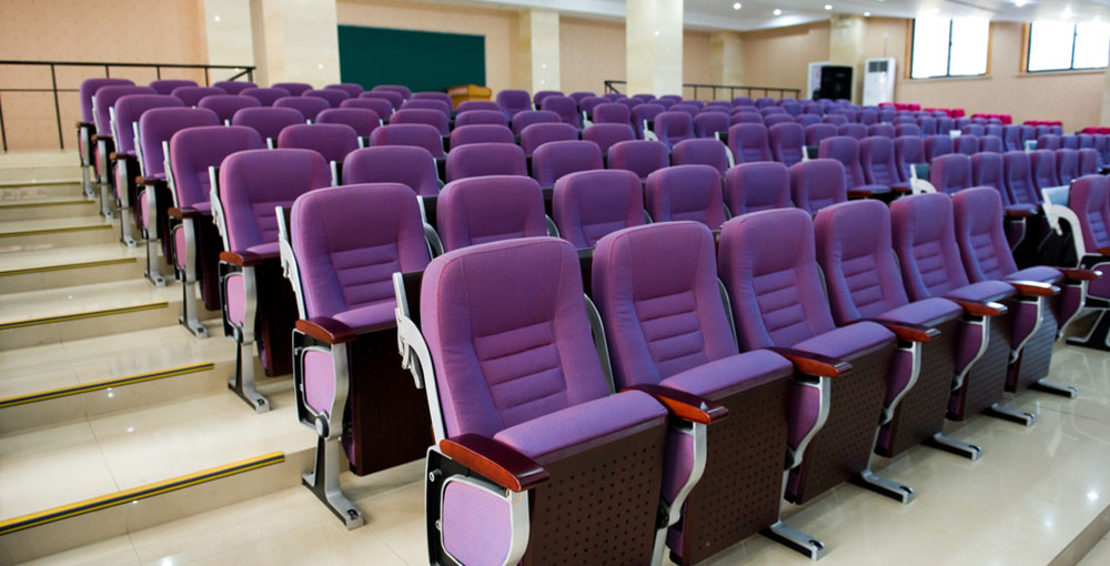
Purple has associations to opulence and royalty but also has links to spirituality meaning this colour works well in rooms meant for contemplation. Social science classrooms, staff rooms and offices benefit from this colour.
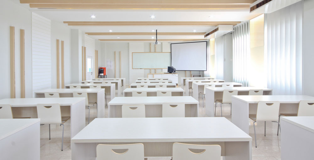
White is the perfect colour for reflecting light and making small spaces look bigger and won't take attention away form any wall displays, white boards etc. The main draw back of this colour is it is very hard to keep clean and shows any marks quickly.